WHAT IS NTOP?
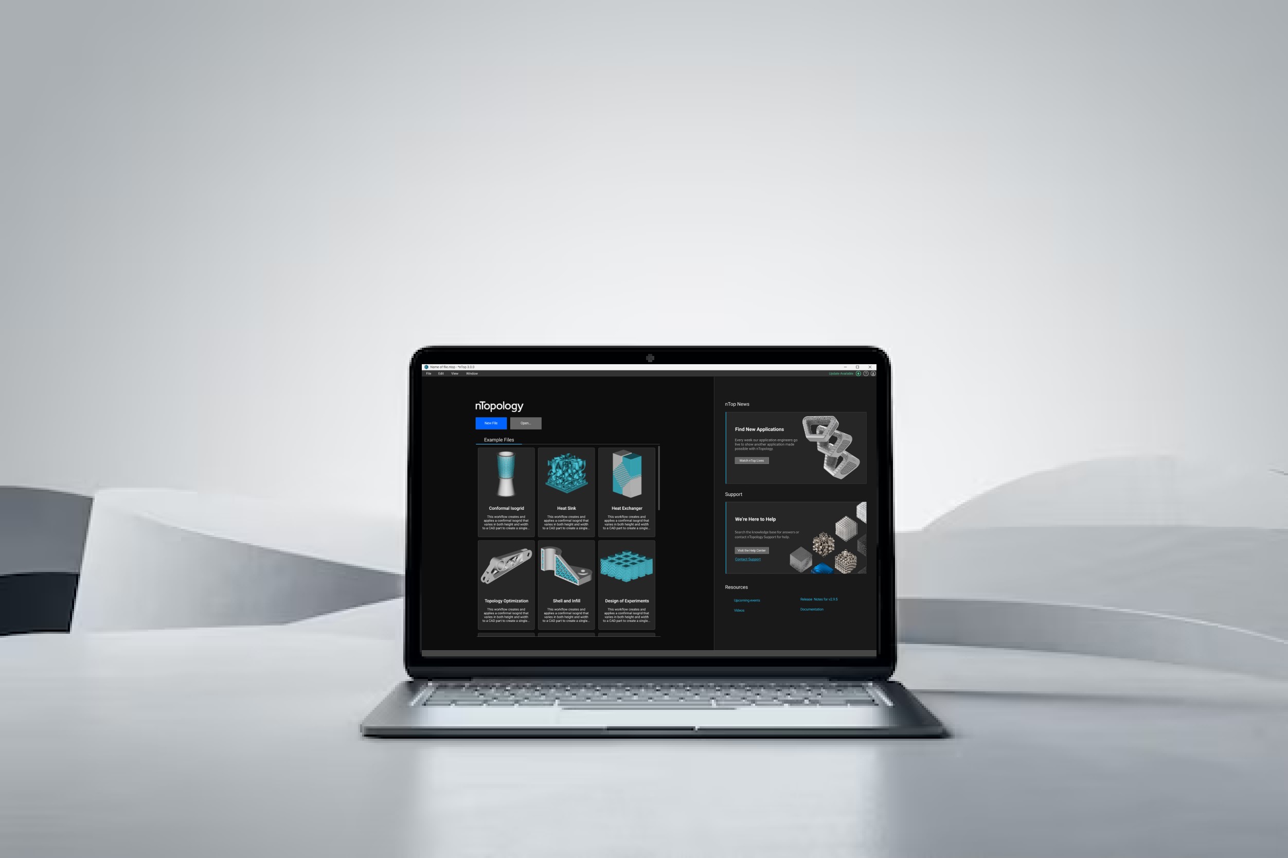
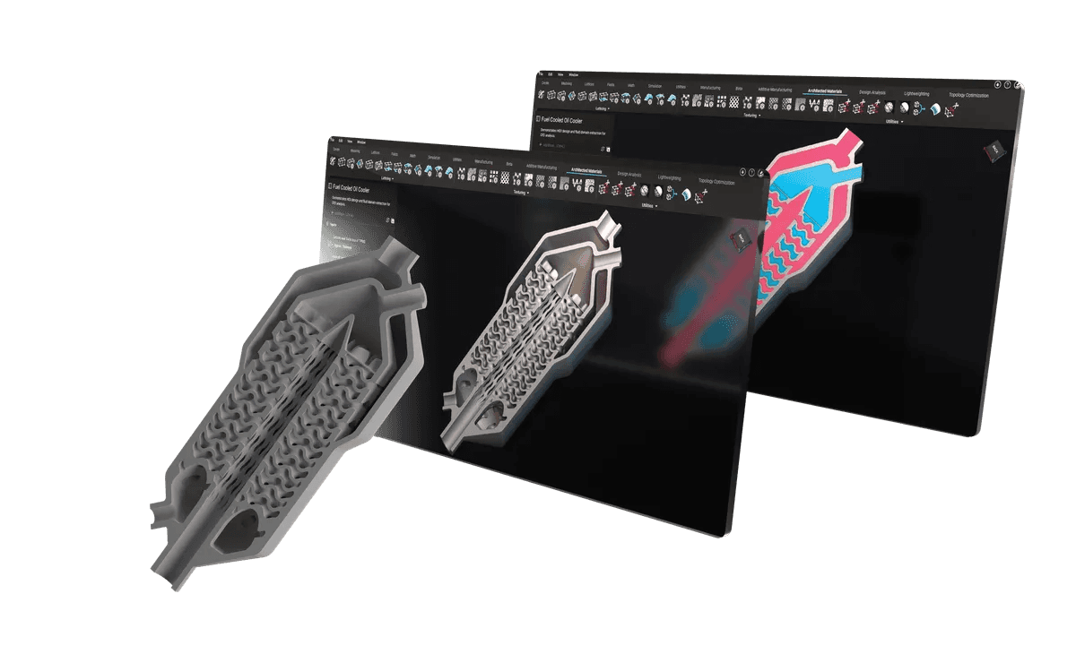
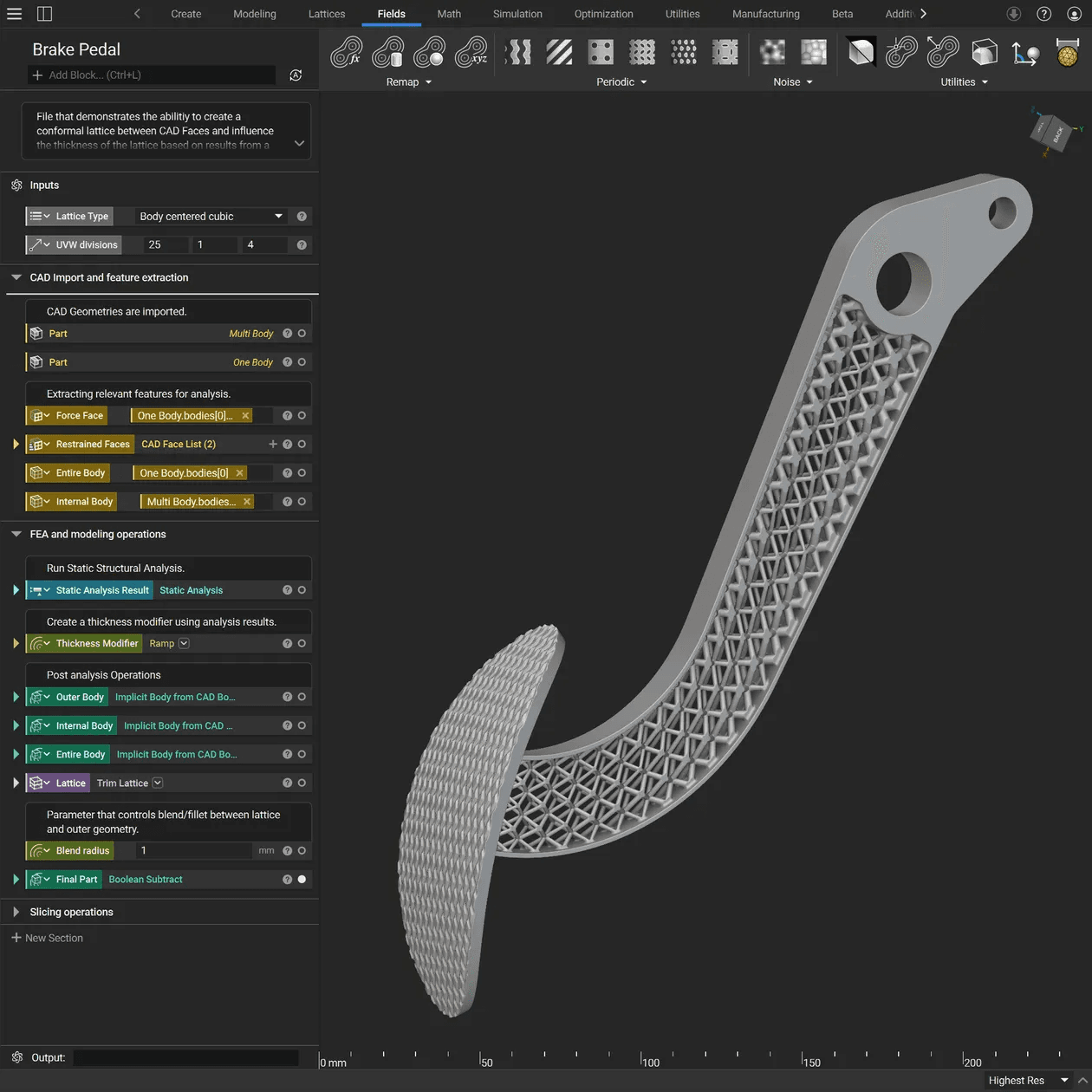
nTop is a computational design software that enables engineers to solve complex problems in additive manufacturing by integrating geometry, performance, and manufacturability into a single, reusable visual programming workflow.
1
Discovery & Research
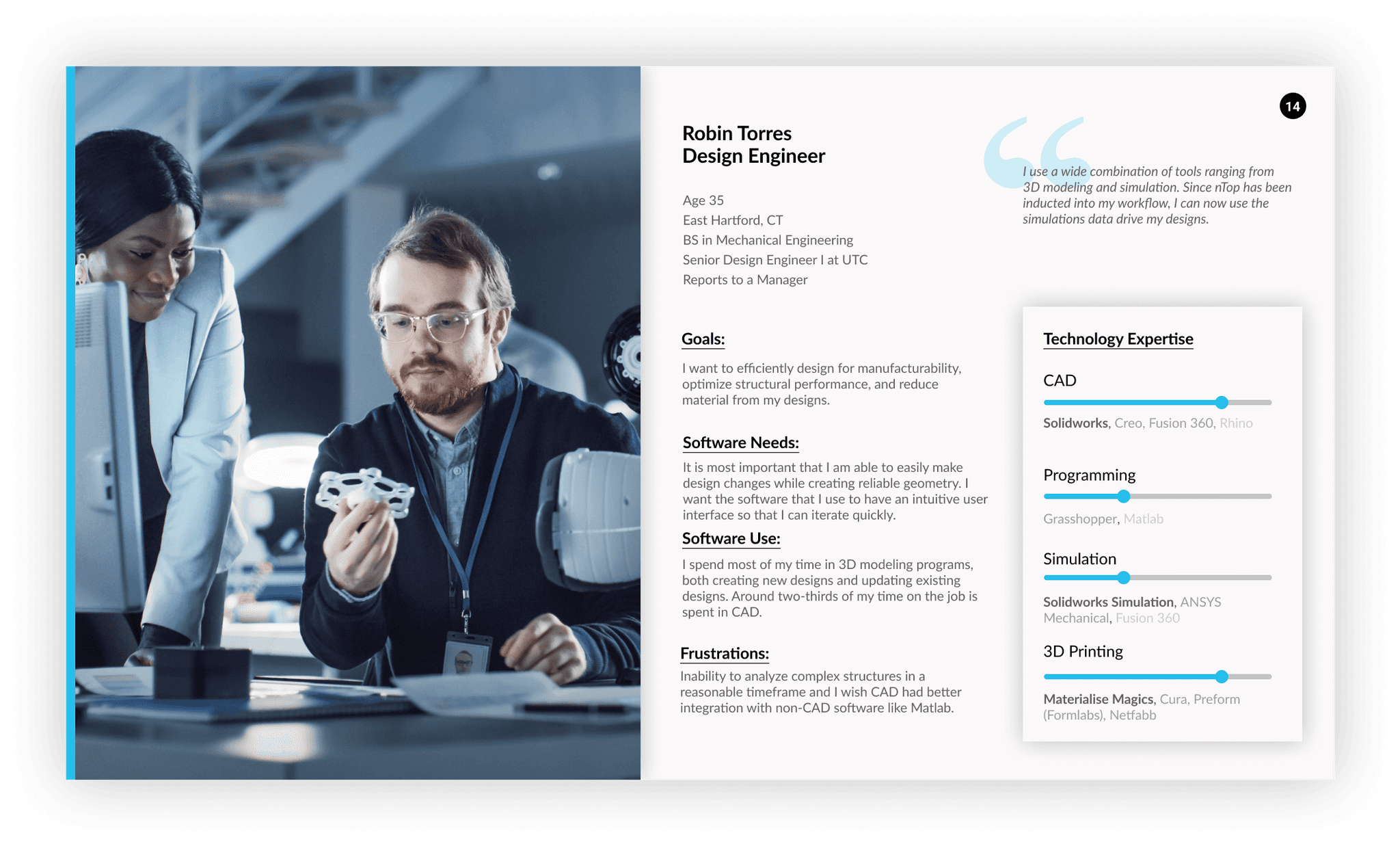
USER RESEARCH
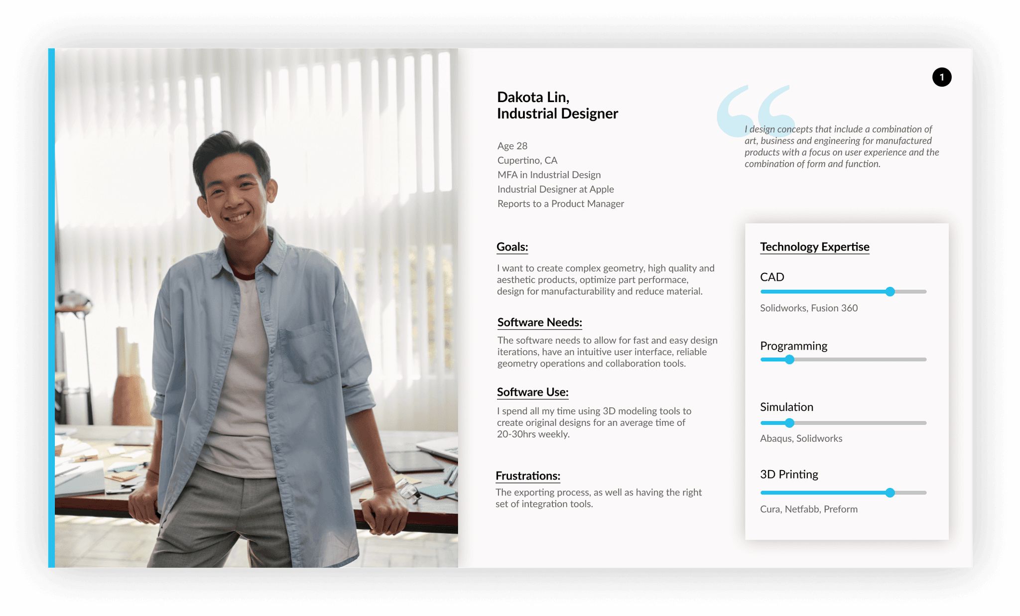
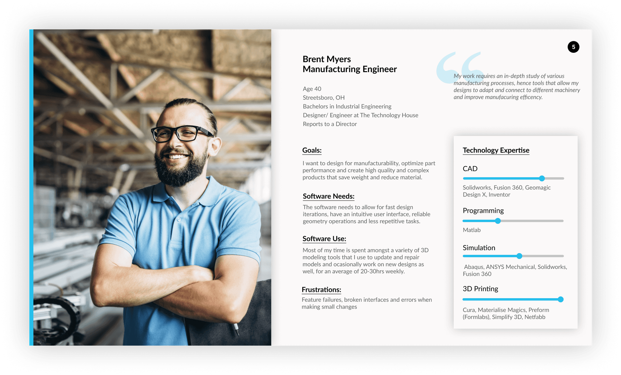
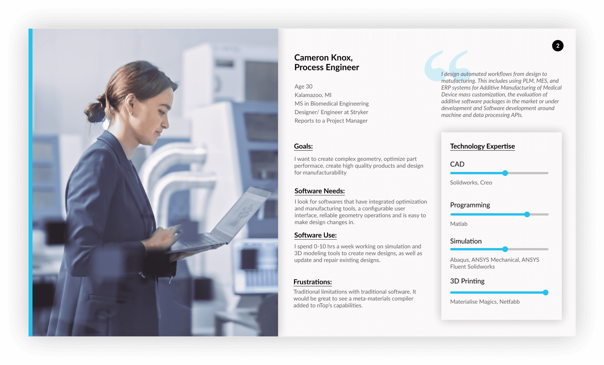
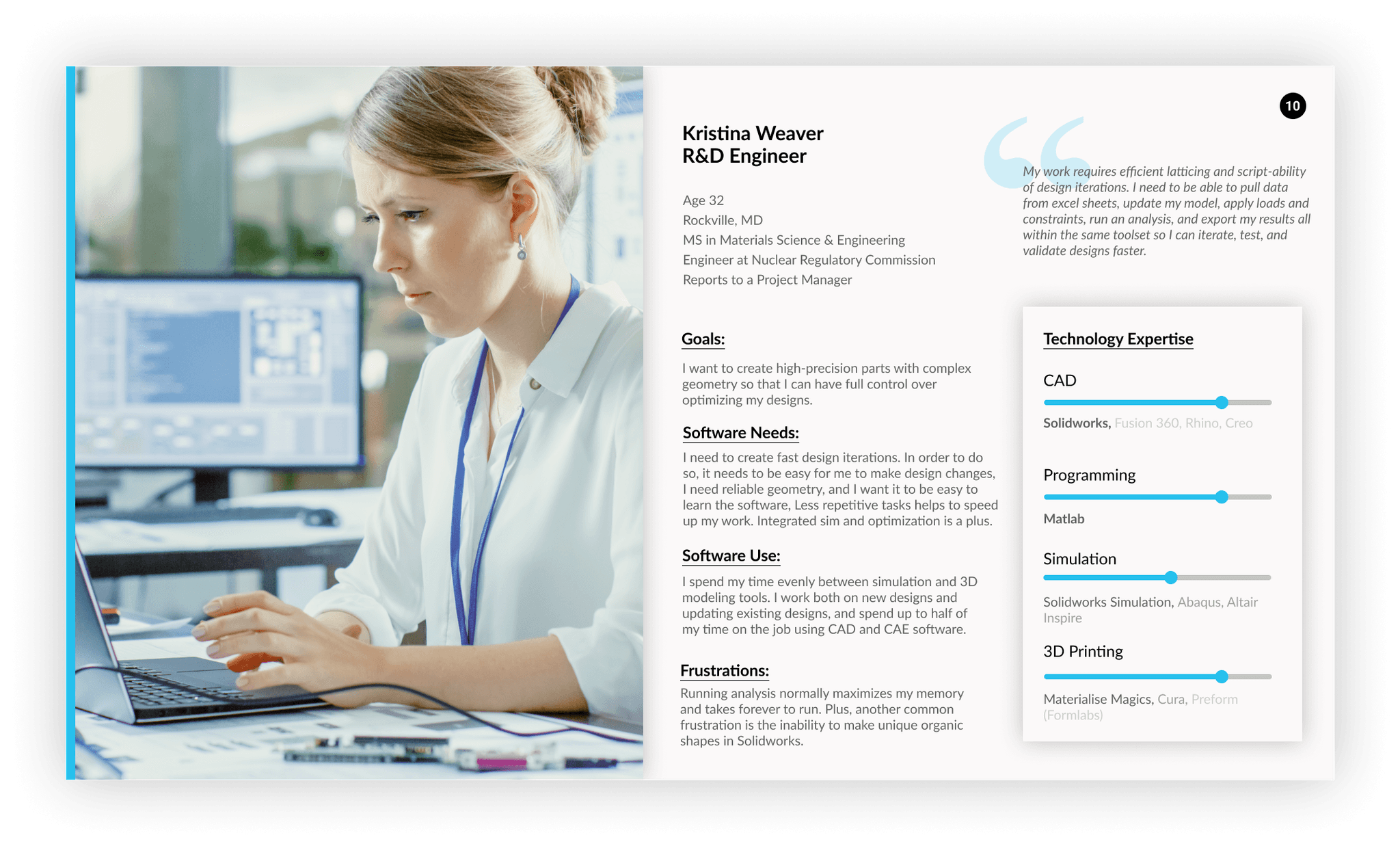
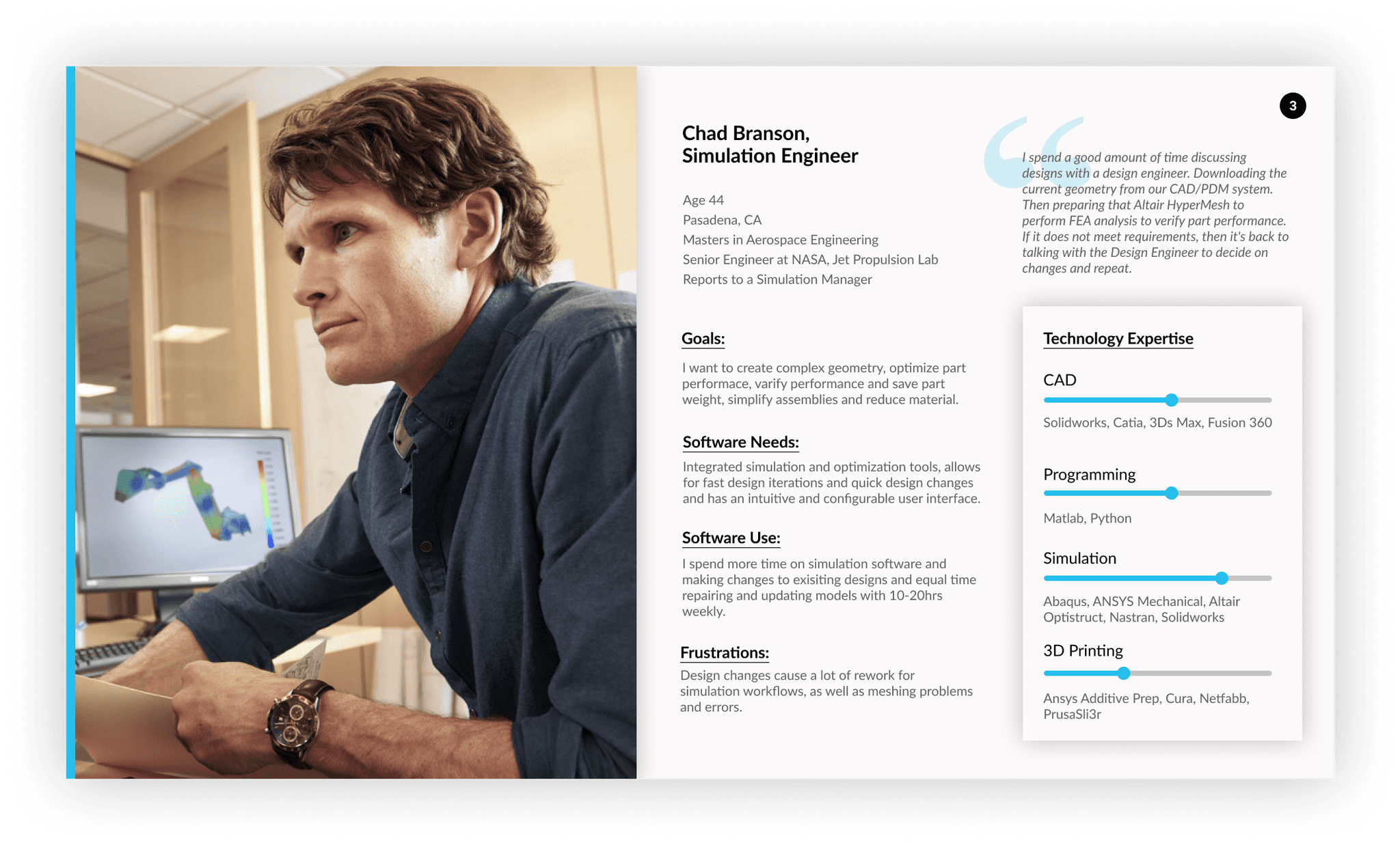
Crafting user personas to synthesize the user needs, goals and behaviors into actionable profiles.
Through surveys distributed among existing users & conducting customer interviews we gained insights into their:
Utilization of nTop
Aspirations
Software requirements
Daily challenges
Familiarity with other software tools
INTERVIEWING SALES REPS
What is the customer acquisition process?
Interviews with sales representatives to understand the process from initial interest to 14 day free trial.
The discussions highlighted a strong reliance on one-on-one training sessions for potential customers due to the software's steep learning curve. Additionally, sales representatives manually process forms to identify potential leads, which is time consuming and prone to human error.
COLLECTING QUANTITATIVE DATA
How satisfied are users with nTop today?
Setting up surveys to create a baseline to track user satisfaction & memorable insights to guide product enhancements.
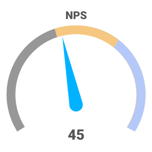
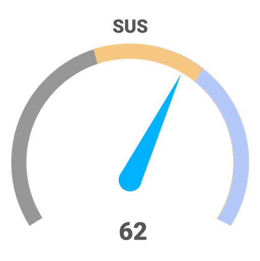
I set up reoccurring usability surveys to quantify the impact of proposed design changes using SUS, NPS, and CSAT metrics.
Respondents were segmented by industry and license duration (30, 60, 90, or 360 days) for comparative analysis. Hosted on Typeform and integrated with Google Sheets, the survey enabled efficient data visualization.
Key Insights
Observation
Overwhelming Interface
New users feel lost or intimidated by the software’s interface
Observation
Failure to Demonstrate Value Quickly
Users abandon the software if they are not able to see value quickly
Observation
Lack of Personalization
Users are coming from different backgrounds, yet we are not personalizing the experience.
2
Design & Ideation
JOURNEY MAPPING
How do users experience nTop across every touch-point?
Building a narrative based on user stories, utilizing insights from personas consisting of actions, interactions, emotions and pain points.
The journey map aimed to address key questions:
Where are the major pain points causing a user to stall or where the next step is unclear?
What are the ineffective touch-points that we can eliminate?
What user personas can we target with
marketing campaigns based on user decisions?How can we increase customer engagement?
BRAINSTORMING
Where can we improve the experience?
Download & Installation
First Launch
First Time the user opens a New File
User Interface Customization
Opening up a Specific File
Help & Support Accessibility
Feedback Mechanism
Reinforcement through Progress Tracking
Identifying 3 Key Strategies
1
Welcome Screen
Provide diverse support material that is easy to find
2
In-product Onboarding Journey
Onboarding should be a structured journey
3
Example files + Feature Gating
Prioritize information, while showing off the product
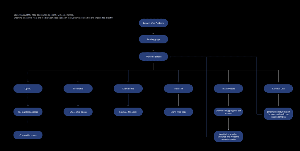
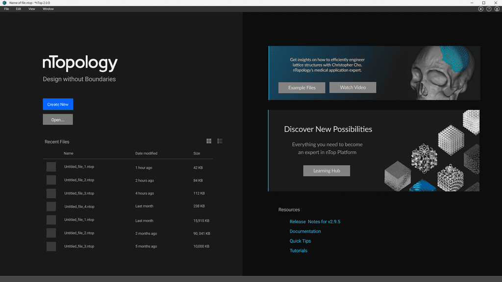
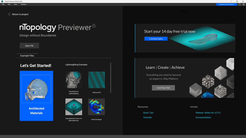
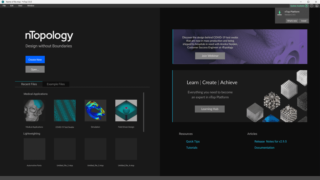
The Welcome Screen
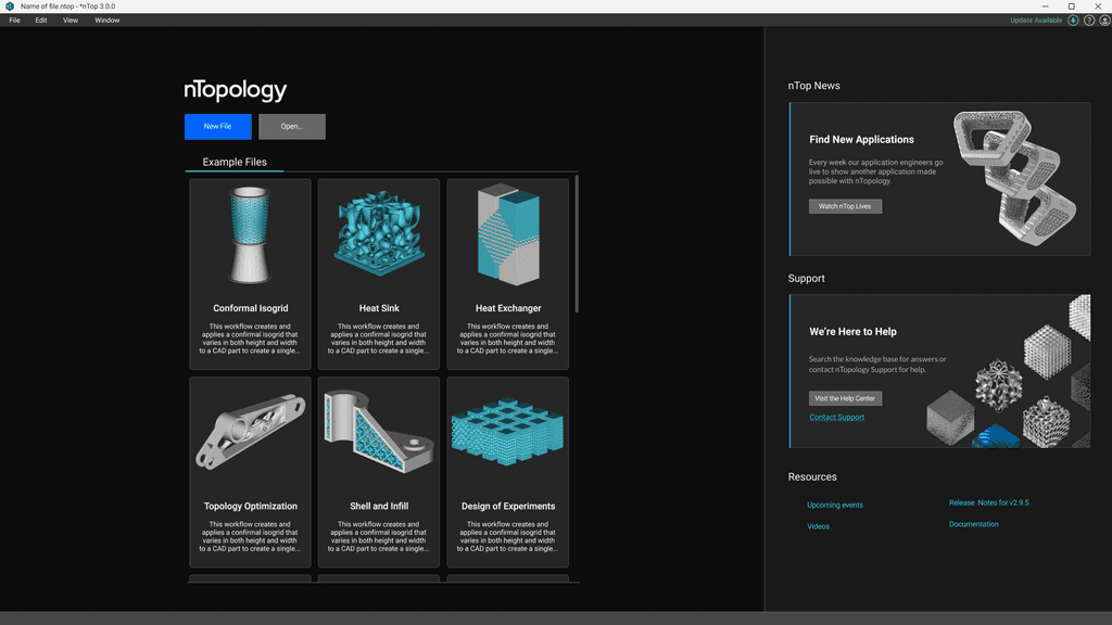
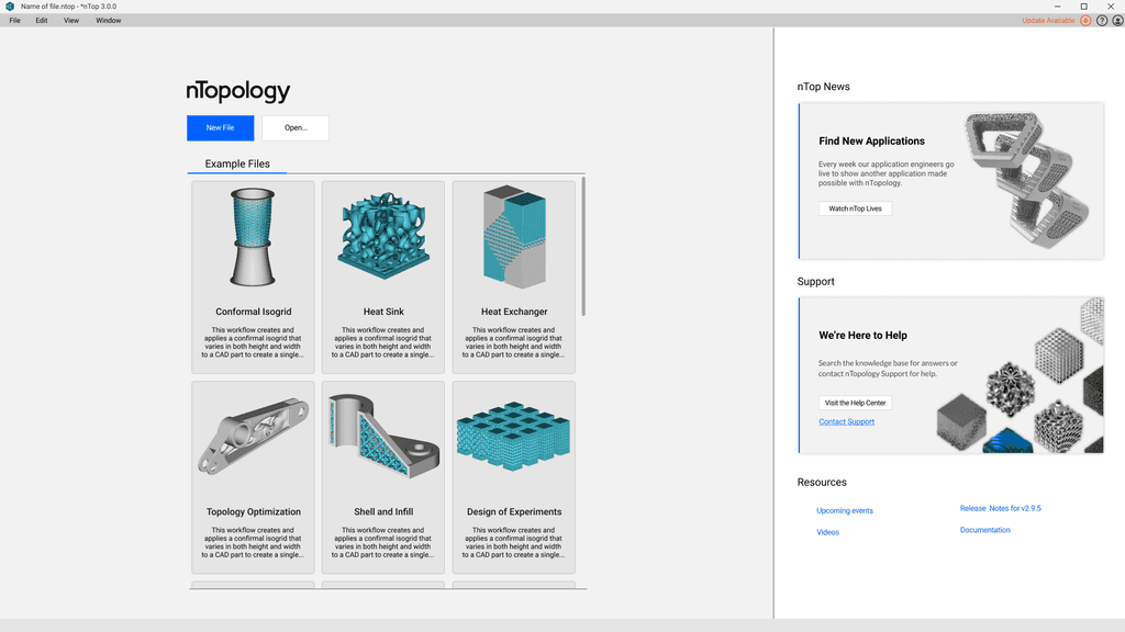
The purpose of the welcome screen to improve customer engagement.
Provide an easy access to support material and blog posts
Exhibit marketing and feature content
Show enthusiasm
Reiterate nTopology's value
Breakdown of key functionality
I prioritized features based on importance to the user's initial experience and used this to guide design decisions.
When showing these designs to customers, they expressed a preference for viewing templates or recent files instead of marketing content on the welcome screen.
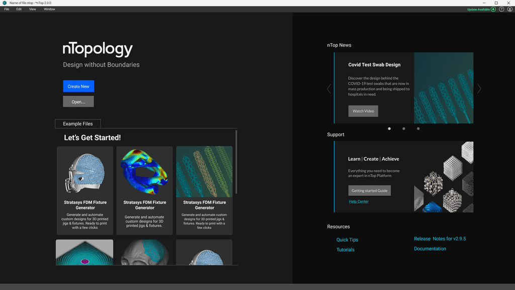
DESIGN SOLUTION: WELCOME SCREEN
Setting the tone with immediate access to files and templates for a seamless start.
Example Files
Demonstrating nTop's value by showcasing it's diverse capabilities and providing a step-by-step guide.
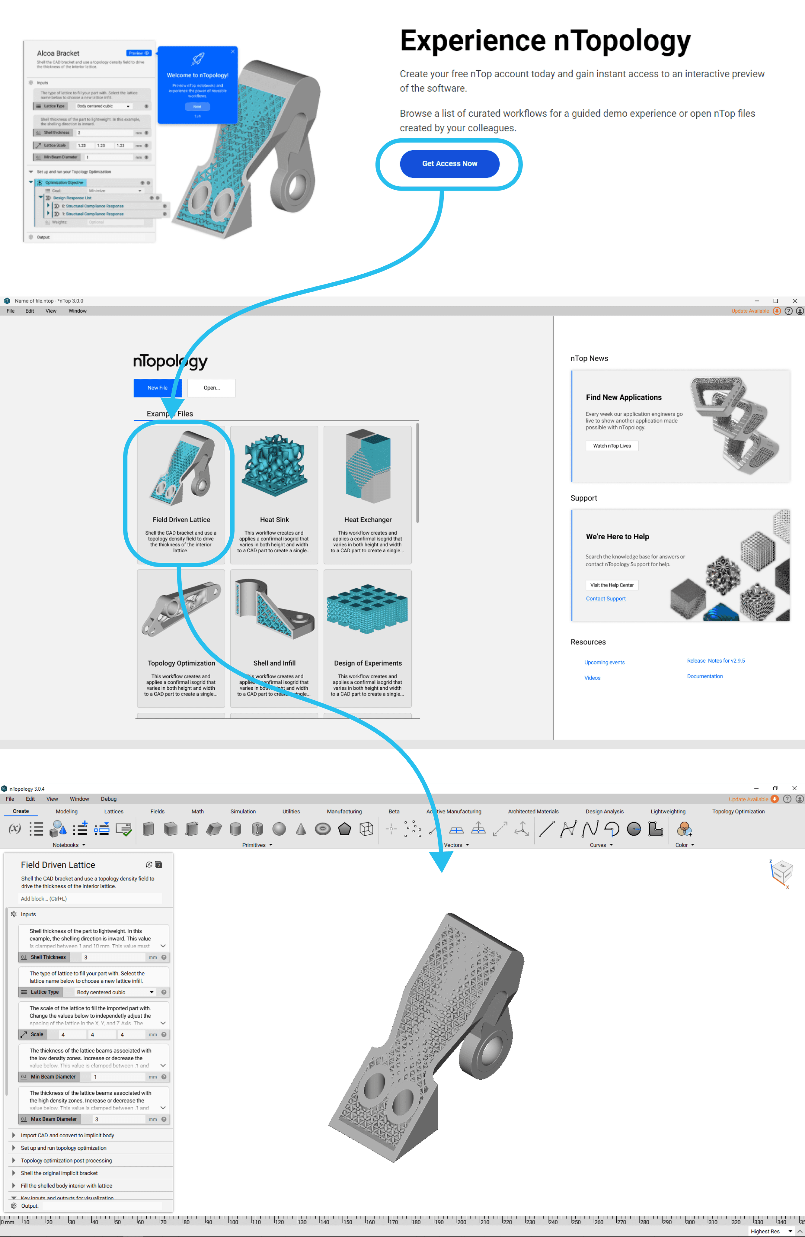
To create a seamless transition from the company website to the software, I standardized elements and image treatments across both platforms. This cohesive approach enhances the user experience and strengthens brand consistency throughout the journey.
User's see the same files on the website and welcome page
In-product Onboarding Journey
A guided in-app onboarding journey designed to welcome first-time users, providing clear, visually distinct cues to navigate and familiarize themselves with the software effortlessly.
This journey consisted of four pop-ups, each featuring a distinct style that set them apart from the rest of the UI. Leveraging the law of similarity, I ensured the pop-ups maintained a consistent design language, making it clear to users that they were part of the same cohesive flow, regardless of their location or the information displayed.
DESIGN SOLUTION: IN-APP ONBOARDING
The UI features rounded pop-ups with uniquely styled buttons, playful icons for approachability, and a high-contrast, brand-aligned color palette optimized for both light and dark themes.
3
Reflection
Navigating this project felt like conducting an orchestra with players from different genres—sales, users, and partners. Each brought their unique rhythm and tone, and my role was to harmonize the cacophony into a cohesive melody, filtering the noise to create a user experience symphony.
Despite the challenges throughout the project, my lessons were invaluable and exceeded every expectation:
Iteration Through Diversity of Thought: Recognizing how varied perspectives enriched the final design by uncovering blind spots and sparking creative problem-solving.
Regular check ins and design reviews: Ensured the final product aligned with expectations.
Data is critical: It helps complete the bigger picture over time.
The design is never complete
